
The Expensive Illusion of Intuition: Why Your Product Team Is Probably Wrong
Or: How a Slightly Misplaced Price Column Nearly Cost Us Millions
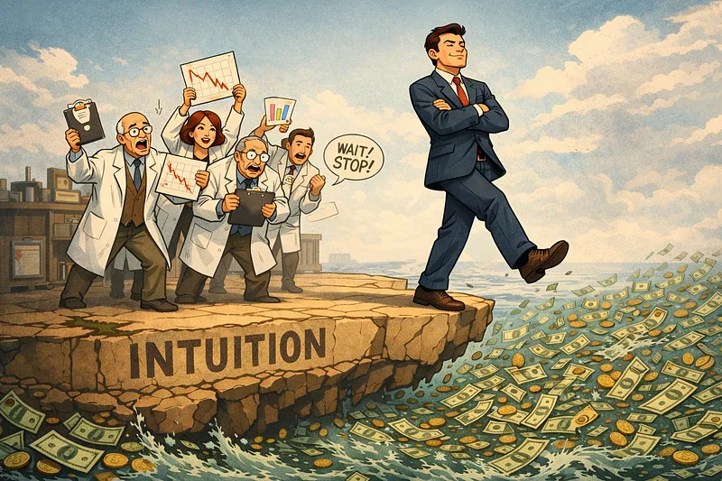
There’s a dangerous myth floating around modern product development — one that’s silently bleeding companies dry while everyone nods along in agreement. It goes something like this: “We know our users. We’ve done the research. Let’s just ship it.”
As the statistician W. Edwards Deming bluntly put it, “In God we trust. All others must bring data.” He was talking about manufacturing quality, but he might as well have been describing that confident product manager who’s absolutely certain users will love the new design — right up until they don’t.
I want to talk about A/B testing. Not the sanitised conference version where everything works beautifully and insights flow like wine at a product launch party. The real version. The one where your beautiful redesign is haemorrhaging money, your “obvious improvement” is actually making things worse, and the only thing standing between you and a career-defining disaster is a properly configured experiment.
The Uncomfortable Truth About Your Intuition
Here’s something that might sting: most changes you ship are either neutral or actively harmful. Industry research consistently shows that only 10–30% of product changes actually improve the metrics you care about. The rest? They’re either doing nothing or quietly making things worse while everyone pats themselves on the back for being innovative.
This isn’t a criticism of your team’s intelligence. It’s an acknowledgment of a fundamental truth: we’re all too close to our own work to objectively evaluate its impact. You’ve spent weeks on that feature. You understand every edge case, every design decision, every elegant solution to problems users don’t even know they have. Of course it’s brilliant. You made it.
The psychologist Daniel Kahneman spent decades studying this phenomenon. His conclusion? “We can be blind to the obvious, and we are also blind to our blindness.” Your confidence in a feature’s success isn’t evidence of its quality — it’s evidence of your proximity to it.
When Beautiful Design Bleeds Money
Let me tell you about a room grid redesign we ran at Agoda. The team had crafted a genuinely better-looking interface for displaying hotel rooms. Cleaner. More modern. The kind of thing that makes designers smile and stakeholders nod approvingly in review meetings.
It was losing. Badly.
Now, the easy response here is to throw up your hands and conclude that users hate change, or that design doesn’t matter, or that you should just give up and keep shipping the same tired interfaces forever. But that’s not what we did. We dug into the data.
When we segmented the results, a pattern emerged. The losses were concentrated heavily among users in China and Indonesia browsing in non-English. These markets weren’t just slightly negative — they were dragging the entire experiment down.
One of my engineers came with a theory. These customer segments tend to be more price-sensitive. They’re comparison shoppers, meticulously weighing options. And in our beautiful new design, we’d moved the price into the same column as the quantity dropdown. A subtle change. Elegant, even. But it made price comparison marginally harder — you had to scan across different visual hierarchies to compare room rates.
We moved the price into its own column. Same design philosophy. Same aesthetic. Just one small structural adjustment.
It won. Handsomely.
Without A/B testing, we would have shipped that original design. It would have looked great in our portfolio. Our stakeholders would have congratulated us on the modernisation effort. And we would have been silently losing money every single day, completely unaware that our “improvement” was actually a regression for our most price-conscious customers.
The Search Bar That Sank the Ship
Here’s another one. Our mobile team had a seemingly obvious idea: add a search bar to the top of the property page. Users who landed on a hotel they didn’t love could easily search for alternatives without having to navigate back. Friction reduced. User journey optimised. Product management approved.
It lost.
Again, we didn’t just accept defeat. We brought in our UX research team to help interpret what was happening. Their theory? On mobile, screen real estate is precious. Images are crucial — they’re often what sells a property. By placing the search bar at the very top, we were pushing the hero images further down the viewport. Users landing on the page were seeing less of what actually matters (the property) and more of an escape hatch they hadn’t asked for.
We moved the search bar below the images. Same feature. Same functionality. Just a different position in the visual hierarchy.
It won.
These aren’t edge cases or anomalies. This is what product development actually looks like when you measure it properly. Small decisions — a column here, a position there — compound into massive financial impact at scale. And without rigorous experimentation, you’re flying blind, optimising for your own aesthetic preferences rather than actual user behaviour.
The Maths of Marginal Gains
The economist Thomas Sowell observed that “There are no solutions, only trade-offs.” In A/B testing, we’re constantly navigating these trade-offs — but we’re doing it with data rather than gut feel.
At Agoda’s scale, even a 0.1% improvement in conversion translates to significant business value. That sounds small until you multiply it by millions of users and hundreds of booking opportunities. Conversely, a 0.1% regression — the kind that might hide inside a “minor” design update — bleeds money continuously, compounding daily.
This is why we can run hundreds of experiments simultaneously without them contaminating each other’s results. Each experiment uses random assignment, splitting users independently using unique tokens. When a user visits, they might be in the control group for one experiment, the treatment group for another, and not eligible at all for a third. These allocations are completely independent.
The key insight is elegantly simple: because every experiment uses a 50/50 split and allocation is random, any effects from other running experiments are distributed equally across your experiment’s A and B groups. They cancel out, leaving you with a clean measurement of your specific change’s impact.
The Fear of Being Wrong
There’s a psychological barrier to A/B testing that nobody talks about at conferences: it means admitting you might be wrong. Every experiment is an implicit acknowledgment that your brilliant idea could fail. That’s uncomfortable. It’s much easier to ship confidently and interpret ambiguous results charitably.
The basketball coach John Wooden once said, “It’s what you learn after you know it all that counts.” Experimentation culture requires a specific kind of intellectual humility — the recognition that expertise doesn’t guarantee insight, and that user behaviour often contradicts expert expectation.
I’ve watched senior engineers resist testing because they’re “certain” their optimisation works. I’ve seen designers push back on experiments because they “know” the new layout is better. I’ve heard product managers argue that testing wastes time when the outcome is “obvious.”
They’re usually wrong. Not because they’re bad at their jobs — they’re often excellent — but because certainty is the enemy of discovery.
What Experiments Actually Tell You
Beyond the binary of “ship it” or “kill it,” properly structured experiments reveal why things work or don’t work. This is where segmentation becomes powerful.
When an experiment shows unexpected results, don’t just accept the headline number. Dig into the breakdowns. Browser segmentation often reveals bugs — if your experiment is flat across most browsers but losing badly in Safari, you probably have a browser-specific implementation issue, not a bad idea. Language segmentation is critical when you support multiple locales — a loss concentrated in specific languages often indicates translation problems rather than design failures. Geographic segmentation reveals market-specific behaviours that might be invisible in aggregate data.
The room grid story I mentioned earlier? We only discovered the price sensitivity issue because we looked at geographic and language segments. The aggregate result just showed “losing.” The segmented view showed “losing specifically in price-sensitive markets where comparison shopping behaviour is most pronounced.” That’s actionable intelligence, not just a red number on a dashboard.
The Competitive Advantage Nobody Talks About
Here’s the thing about our competition: many of them are burning through venture capital, shipping features based on conviction, and hoping the market validates their intuition. It’s a romantic approach to product development — the visionary founder who just knows what users want.
It’s also a terrible business strategy.
A/B testing is boring. It’s slow. It requires infrastructure investment and cultural change. It means accepting that your ideas will frequently fail, and that failure is valuable information rather than personal criticism. None of this makes for compelling pitch decks or inspirational LinkedIn posts.
But it works. It works because reality doesn’t care about your roadmap or your stakeholder commitments or your confidence level. Reality cares about what users actually do, and experimentation is the only reliable way to measure that.
The investor Warren Buffett put it simply: “Risk comes from not knowing what you’re doing.” Every feature you ship without testing is a gamble on your intuition. Sometimes you’ll win. But over thousands of decisions, the house edge of human cognitive bias will grind you down.
The Bottom Line
Those two stories — the room grid and the search bar — weren’t exceptional. They’re representative of what happens constantly in product development. Small decisions with massive financial implications, invisible without measurement, obvious in hindsight.
The room grid redesign, without proper testing and iteration, would have resulted in annual losses. Not because the design was bad, but because a single column layout decision didn’t account for how price-sensitive customers actually compare options. The search bar, shipped without testing, would have degraded the mobile experience daily. Not because the feature was wrong, but because its position undermined the visual hierarchy that actually drives conversions.
Neither of these issues would have surfaced in user research sessions. Neither would have been caught by internal review. Neither would have been obvious from analytics dashboards showing overall traffic patterns. They required experimentation — the systematic isolation of variables and measurement of outcomes.
This is why we win in the market. Not because we’re smarter or more innovative or better funded. Because we admit what we don’t know, and we’ve built systems to find out.
As the scientist Richard Feynman observed, “The first principle is that you must not fool yourself — and you are the easiest person to fool.” A/B testing is, at its core, an institutionalised defense against self-deception. A systematic acknowledgment that intuition, however educated, is not evidence.
Your beautiful redesign might be brilliant. It might also be bleeding money. The difference between those outcomes isn’t talent or effort or intention. It’s measurement.
Now, if you’ll excuse me, I need to go check on an experiment that’s been running for two weeks. The results are looking promising, but I’ve learned not to trust promising until the statistics tell me I can.