
The Dashboard Delusion: Why Your Metrics Are Just Expensive Wallpaper
Or: Why Your Team Spent Two Sprints Building Beautiful Charts That Nobody Checks
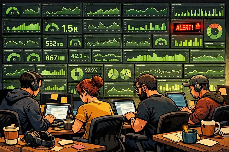
It was 3:20 on a Thursday, and Somchai was pulling up the first slide. The meeting room on the fourteenth floor smelled like instant coffee and nervous preparation — the kind of warmth that comes from six engineers crammed into a space designed for four, laptops radiating heat onto the table like small space heaters. They’d spent weeks on this. The Grafana panels loaded in a cascade of green and blue, colour-coded precisely, each chart aligned to a different facet of their application’s telemetry. The fonts matched. The time windows were synchronised. It was, by any visual standard, beautiful.
I’d asked them to focus on semantic monitoring — alerting on the business metrics that tell you whether your application is actually doing what it’s supposed to do, not just whether the servers are warm. What I got instead was an art exhibition.
“Not everything that can be counted counts, and not everything that counts can be counted.” — William Bruce Cameron
That quote should be etched into every Grafana instance’s login screen. Because we have a dashboard problem in this industry, and it’s not that we don’t have enough of them. It’s that we’ve confused the act of building dashboards with the practice of observability. We’ve mistaken the map for the territory, the menu for the meal, and a wall full of charts for a team that understands its system.
The Art Exhibition
Let me finish that story, because it’s instructive.
After the team walked me through every chart — explaining which processes mapped to which panels, how the data was aggregated, how they’d tuned the refresh intervals — I pressed them on the part that actually matters.
“How about the alerts?”
The room went quiet for a few seconds. That particular flavour of silence where you can hear the air conditioning struggling. Somchai spoke up first: “We will set alerts at this level — you see there’s a daily dip in the data overnight, so we need to set the threshold low to avoid overnight noise.”
I looked at the dashboard. The peak-hour traffic was roughly ten times the overnight volume. “So that means if we have a production incident during the day, we have to wait until traffic drops to 2 AM levels to notice?”
Somchai thought about it. “Yes.”
At least he was honest. “I think we can find a better way than waiting twelve hours and waking you up at 2 AM, right?”
The team laughed. I was serious though. They’d built something genuinely impressive — and the data was all there. If you knew where to look, if you knew it existed, if you navigated to the right panel at the right time, you could find what you needed. But that’s the problem. There was nothing proactive about it. No alert to wake you up, no threshold to tell you something had gone wrong, no nudge to say “hey, look at this now.” The information existed — buried behind a URL and a dropdown, waiting patiently for someone to come looking. That’s not observability. That’s a treasure hunt.
This isn’t a story about one team getting it wrong. This is the default outcome when we treat dashboards as deliverables rather than as instruments. The dashboard was the goal, not the decisions it should drive.
Version 2,304 of the Same Thing
Here’s something I see constantly and it drives me slightly mad: teams building custom dashboards for infrastructure metrics they don’t need to collect themselves.
We live in a world of zero-code instrumentation now. OpenTelemetry — or if you’re in the .NET world, its predecessor Application Insights — can automatically collect telemetry around HTTP requests, SQL queries, Redis calls, and most of the infrastructure plumbing your application touches. You don’t need to write code for this. You definitely don’t need a team spending two weeks building custom Grafana panels for it.
Here at Agoda, we have roughly 430 production applications sending telemetry metrics that you can view on a single dashboard — just a dropdown to select which application — using Application Insights. We’ve been running this for the last eight years. It works. We collected a lot of internal users over that time, and not because it’s pretty. Because it’s useful and it’s the same experience for everyone.
If you have wildly different thresholds across systems, your alerting platform should handle that — and ideally you standardise your approach. Rather than alerting on raw counts like “more than X 500-errors per minute,” try alerting on percentages: the ratio of 5xx responses to successful 2xx responses. This scales naturally with traffic volume. It means your 2 AM traffic dip doesn’t create a blind spot, and your peak-hour spike doesn’t trigger false alarms.
The principle is simple: don’t write code or build dashboards when you don’t need to. Every custom dashboard is code you have to maintain, and — as I’ve written about before with code entropy — everything you build is something that starts decaying the moment you ship it.
What Your Dashboard Should Actually Tell You
There’s a hierarchy to observability that most teams get backwards. They start at the bottom — infrastructure metrics, error rates, CPU spikes — and try to work up to understanding whether the system is healthy. The problem is, you can have green lights across every infrastructure panel and still have a business that’s bleeding out.
This is what Sam Newman calls semantic monitoring in his book Building Microservices, and it’s the concept I keep coming back to with every team I work with: monitor what your application does, not just how it runs.
I wrote about this at length in a previous post on semantic monitoring, but the core idea bears repeating here because it’s the lens through which every dashboard should be evaluated. Your application exists to perform business operations — process bookings, send messages, complete searches, whatever. Those are the metrics that tell you whether your system is fulfilling its purpose. Everything else is diagnostic detail.
Think of it in three layers:
Layer one: Infrastructure telemetry. HTTP response times, error rates, database latency, queue depths. This is the stuff auto-instrumentation handles. You need one standardised dashboard for this. One. Not twelve. Not one per team. One, with a dropdown.
Layer two: Business-level metrics. What does your application actually do? How many bookings processed? How many searches returned results? How many messages delivered? This is semantic monitoring — and this is where your custom dashboards should live. This is where the investment in bespoke charts and carefully tuned alerting actually pays dividends.
Layer three: Decision-driving context. This is the layer almost everyone misses. A dashboard that shows you request latency at p99 is data. A dashboard that shows you p99 latency is degrading for users in segment X since deploy Y, and links to the relevant runbook — that drives a decision. The distinction matters enormously:
Decorative metrics answer “what is happening?” in a general sense. They look impressive in reviews.
Decision-driving metrics answer “what should I do differently right now?” They’re often ugly, opinionated, and have thresholds and alerts baked in.
The value of a metric is measured by the behavioural change it produces. If your dashboard doesn’t cause someone to investigate, escalate, or fix something, it’s just a number on a screen. A very well-formatted number on a screen, but a useless one nonetheless.
The Alert That Saved a Quarter
Let me give you a counter-example — a story about what happens when you get this right.
We had a major rollout of a new search backend. Massive rewrite, new system, all the problems that come with massive rewrites — which, as I’ve explored in a previous post about the greenfield myth, are almost always the same problems you had before, just wearing different clothes.
The first quarter after the rollout, the search page team’s out-of-hours calls went through the roof. Nightly latency spikes. NOC escalations at 1 AM, 3 AM, 4 AM. Ninety-nine percent of the calls were caused by the new backend, not the search page itself. The team was being woken up for problems they couldn’t fix — only escalate.
So they did something beautifully simple. They added a single line of context to the NOC alert: “Before you call the search page team, check this dashboard [URL]. If the metric is elevated, call the backend team instead.”
Their out-of-hours calls the next quarter? Dramatically healthier. One line of context. One link. One instruction that said: here’s how to tell whose problem this actually is, and here’s what to do about it.
This is what I mean by decision-driving metrics. The dashboard wasn’t decorative. It was a decision tree embedded in an alert. It didn’t just tell you what was happening — it told you what to do about it.
And it especially helps new people. You can go beyond this — add links for whoever is on call to check, add diagnostic steps, add runbook URLs. Remember that the next person on call might be new. They might be unfamiliar with the system. They will deeply appreciate the context you leave for them, and they’ll be able to resolve issues faster because you invested the five minutes to make the alert actionable rather than just informational.
The “Build It and They’ll Come” Fallacy
The basketball coach John Wooden once said, “Don’t mistake activity with achievement.” He was talking about practice, but he might as well have been describing our relationship with observability tooling.
There’s a deeply satisfying feeling that comes with deploying a dashboard. Panels light up. Metrics flow. You can point at the screen and say “we have observability now.” It feels like achievement. It feels like progress.
But observability isn’t a state you achieve by deploying dashboards. It’s a practice. It only exists if someone is actually observing — and then acting on what they see. A dashboard with no alerts is a television nobody watches. A dashboard with alerts but no runbooks is an alarm clock with no snooze button and no instructions for what to do when you wake up.
I see this pattern repeatedly: teams invest heavily in the build phase — the colours, the layouts, the data aggregation — and almost nothing in the operational phase. What threshold triggers an alert? Who gets paged? What do they check first? What’s the escalation path? These questions are unsexy. They don’t produce impressive screenshots for the team showcase. But they’re the difference between a dashboard that decorates and a dashboard that delivers.
If your dashboard doesn’t change behaviour, it’s just expensive art.
Designing Backwards
The fix is straightforward in principle, difficult in practice: design your dashboards backwards.
Don’t start with “what data do we have?” Start with “what decision will this help me make?”
If you can’t articulate the specific decision a metric supports, you probably don’t need it on the dashboard. This feels brutal — engineers love collecting data, and I’m not immune to that instinct — but a focused dashboard with five panels that each drive a clear action will outperform a sprawling canvas of thirty panels that nobody reviews.
This also connects to something I’ve written about with developer experience measurement: the gap between measuring and acting is where most organisations lose the plot. You can have perfect data and still make terrible decisions if nobody’s connected the data to a feedback loop. Someone needs to own each metric. There needs to be a threshold that triggers action. And the action needs to be clear.
A dashboard full of activity metrics — deploys per day, PRs merged, lines of code — can create an illusion of health while the actual outcomes — user impact, reliability, developer friction — go unmeasured. As I explored in the technical debt post, if you only measure feature delivery, feature delivery is all you’ll get. The things that keep your system sustainable and your engineers sane need to be visible too — and that starts with what you choose to put on the dashboard.
The Ugly Truth About Good Dashboards
Here’s a slightly tongue-in-cheek observation, but there’s genuine truth in it: the most useful operational dashboards I’ve encountered are often the ugliest.
They’re single-purpose. Sparse. Focused on anomalies rather than looking impressive in a stakeholder presentation. They have bold red thresholds rather than tasteful gradients. They show you one thing clearly rather than everything vaguely.
The prettiest dashboards tend to be the ones built for showcasing to leadership. The most useful ones tend to be the ones built by the on-call engineer who got woken up three times in one week and decided to build something that would help them triage faster.
If you find yourself agonising over the colour palette of a Grafana panel, you might be building wallpaper. If you find yourself agonising over the alert threshold that determines whether someone gets woken up at 3 AM, you’re building something that matters.
The Bottom Line
Your dashboards are probably beautiful. They might even be accurate. But if they’re not changing how people make decisions — if nobody’s looking at them until something goes catastrophically wrong, and even then they’re not sure what to look at first — they’re expensive wallpaper.
Build your infrastructure monitoring once, using auto-instrumentation, and stop reinventing it. Focus your custom dashboard energy on semantic monitoring — the business operations your application exists to perform. Design every alert around a decision: what’s wrong, how can I tell, and what should I do? And for the love of everything, add context to your alerts. A link, a runbook, a single sentence that tells the next person on call where to look. Future-you — or the new hire pulling their first on-call shift — will be grateful.
Observability isn’t dashboards. Observability is the practice of understanding your systems well enough to act when something goes wrong. The dashboard is just the tool. Don’t confuse the tool with the practice.
Now, if you’ll excuse me, I need to go check a dashboard. Not because an alert fired — nobody’s set up the alerts yet.